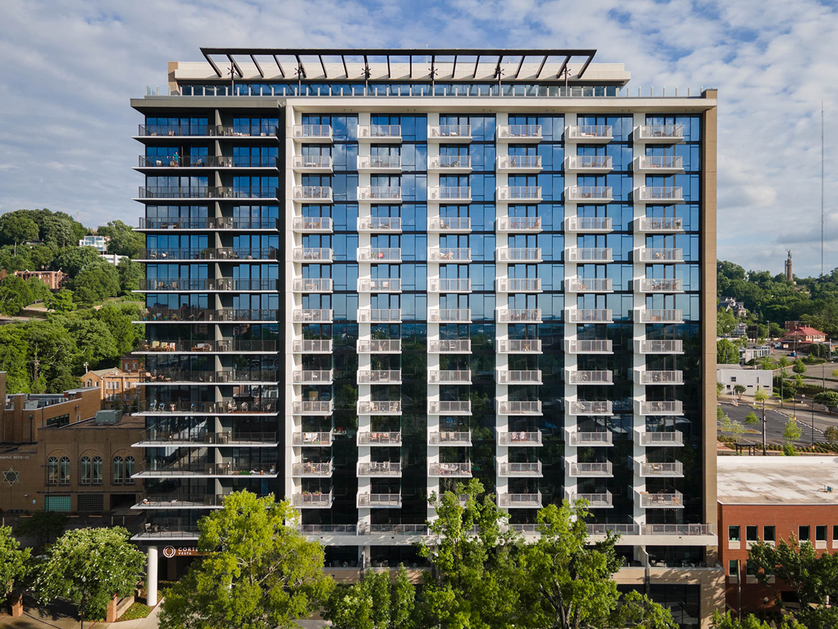

A one-point composition accomplishes many things when done right. It highlights the strongest parts of a design — but it can also reveal its weaknesses.
One-points are naturally suited for balance. The simplicity of a balanced photo lets your brain spend energy elsewhere: on the colors, shapes, materials, and context of the scene.
As an architectural photographer in Birmingham, I’ve noticed that most of the buildings here fall into one of three categories — boring, intricate, or nearing modern.
Birmingham is growing. The city needs to attract young professionals and keep them here — and that means good design.
There’s been an onslaught of luxury apartment buildings downtown, but most of them feel stale. Courtland Vesta felt different somehow. It felt like the perfect candidate for the one-point treatment.
Well, I’m not really supposed to explain my photos. It’s like explaining a punchline — it makes it worse.
But since you’re here, I’ll share why one-points are one of my favorite compositions, and how they work in architectural photography.
Let’s get into it.
A square building isn’t very common in Birmingham. As an architectural photographer here, this is the only photo I’ve taken that highlights a building shaped like this — and I wanted to show it off.
It’s a powerful shape. In real life, it’s the first thing you notice about the structure. The one-point composition places the square inside of a square.
From any other angle, that shape disappears. I wanted the photo to mirror the reality of seeing this building in the distance.
The concrete columns, rows, and the awning atop the building are the next things I notice.
A square can be boring — after all, I am one.
Architectural photography should call attention to the details. By giving your brain a break from analyzing complex scenes, you can find these forms much more easily.
It’s my job as an architectural photographer to highlight the design details my clients work so hard to implement.
Notice the column that splits the building in two — I used it to split my image in two.
Architectural photography has to work with the architecture. You shouldn’t force an image.
Because the image is easy to digest, you can more comfortably examine its context.
To the right, you can spot the Vulcan, a landmark in Birmingham. Including context like this grounds the photo in reality for local viewers.
Beyond that, the trees frame the building perfectly — creating a natural harmony between man-made and organic forms.
If possible — yes.
The one thing to be mindful of is that a one-point can expose asymmetries. In interior design, that’s often unavoidable. The hood, kitchen island, light fixtures — they should align, but they often don’t.
With architectural photography, your main shot is typically the exterior, and architects have more freedom to play with form and proportion. Interior design, on the other hand, has to balance functionality, space, and budget — all within the architect’s groundwork.
I plan on doing a series on one-points. I’ll probably name it something dumb like “Head On.”
The point is — I love one-points.
And if you hire me as your architectural photographer in Birmingham, you can count on me finding plenty of them.
They’re bold, simple, and strong — the perfect composition in my book.